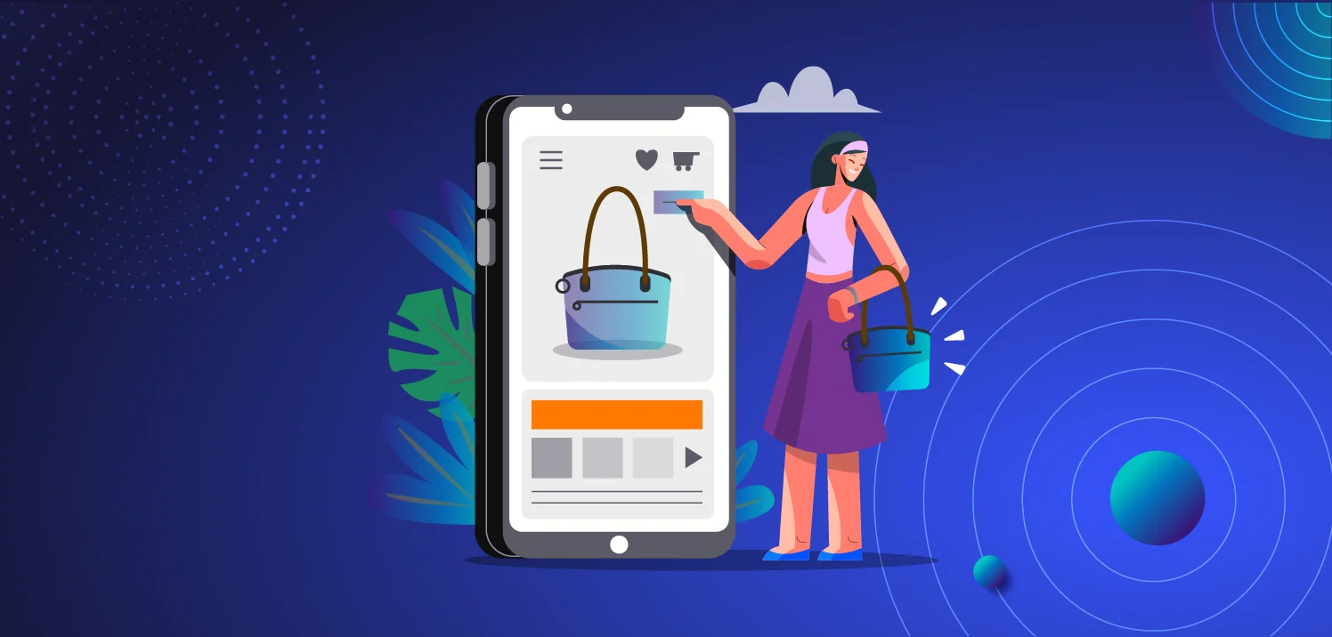
Product pages are where first impressions are made and sales are won. While some brands stick to the basics with simple images and descriptions, others go all out with interactive features that transform browsing into an experience. Whichever path you choose, know that in the current market situation you win by using your data better than your competition.
Effective product pages convey your value proposition, make it clear to potential customers not just what the product looks like, but also what it feels like to own it. Your product page should turn interest into desire, leveraging everything from high-quality images, videos and detailed descriptions to reviews and personalization to convince visitors they need what you offer.
If you’d like to take your onsite marketing game up a notch, you can generate unique coupon codes and embed them on your product page to further enhance the experience.
I’d like to walk you through some of my favorite product page examples and highlight what makes them exceptional. The aim is to inspire you to borrow these ideas for your next product page design.
Let’s dive right in!
1. Alo’s product page
One of the BIGGEST problems with online shopping is finding the right size. Pictures often show clothes on a model who doesn’t match your actual size, but looks freakin’ awesome.
This can make it hard to know how a piece will look once you put it on.
Alo tackles this issue head-on. They let you pick a model who shares your size.

This smart move has several upsides:
First, it boosts confidence in buying. You see how the clothes fit on a body like yours. No more guesswork about the look or fit.
Second, it cuts down on returns. If you give your customers the tools they need to better understand the size and fit before buying, they’re less likely to get it wrong.
Third, using different models respects diversity. It shows that fashion is for everyone, no matter their size.
Alo’s approach to showcasing their products with models of varying sizes not only improves customer experience but also makes business sense by reducing returns, improving the customer experience.
2. Zalando’s product page
Zalando’s product pages serve as a great example of how to use personalization well. After you’ve bought an item, they ask you to rate the fit and they will keep that in mind for your future visits.
Next time you’re browsing, they suggest sizes and pre-fill the sizes you’ve rated as “fits good” if it’s available. It’s a game-changer because it makes shopping feel like it’s tailored just for you.

This method saves time. You don’t have to enter your size every time. Also, it lowers the chance of getting the wrong size. That’s a big plus since it means fewer returns for them and less hassle for you.
Plus, their outfit generator is smart. It looks at what you view and buy, then creates full looks for you automatically. It’s like product recommendations on steroids. This personalized touch can make you feel seen, understood, and catered to.

Zalando’s approach to personalization makes the entire customer journey smoother and more intuitive than most other brands out there.
3. KICKS product page
KICKS, Sweden’s leading beauty retailer, boasts an extensive membership club surpassing 2 million. With a vibrant community of over 100,000 members actively sharing their skincare routines and product favorites, KICKS has become more than a store—it’s a destination for beauty enthusiasts.

Their product page is a prime example of how to use customer data to improve the experience. It ticks every box, from offering smart recommendations—showing what others have paired with the product—to unique selling points (USPs) that vary whether you’re a logged-in member or an anonymous website visitor. They also have instructional videos which adds a layer of engagement, guiding customers on how to get the best out of their purchases.
What truly sets KICKS apart is their innovative use of community-driven data.
Beauty Talks, their in-house forum, is not just a place for discussion but also a creative space where members can curate beauty kits. Each beauty kit is a collection of products intended for specific skincare goals, like a three-item set for a complete routine. These kits aren’t just user favorites; they’re a form of crowdsourced product recommendations, adding authenticity and community validation right on the product pages.
This strategy enhances the shopping experience while also promoting their community.
4. Nordstrom’s product page
Most online stores have product recommendations on their product pages that show you what others liked or bought.
This can be helpful, but it misses a key point. If it doesn’t fit, it’s not right for you. What matters most when shopping for clothes? Size. It’s the deal-breaker.
Nordstrom gets this. Their recommendations start with size.
Change the size on a product page, and the recommendations update in real time. They adapt to show clothes that match the new size you’re looking at. This is clever because it keeps the options relevant and personal to you.
Pay attention to the product recommendations on the right side of the screen.

This real-time updating is crucial. It means you’re always seeing what’s available in your size, right when you’re looking. No more disappointment from finding the perfect style, only to see it’s not in your size.
They go further, too. Stylists make videos with tips on wearing and styling items.

It’s an approach that shows Nordstrom understands shopping for clothes is as much about fit as it is about fashion.
5. Kiziks product page
Videos bring products to life in ways static images can’t match. They capture the nuance and motion, offering a richer experience. Kizik’s innovative use of picture-in-picture video on their product page exemplifies this beautifully.

While customers examine a static image of the shoe, a video plays simultaneously, showing the shoes in action. This dual perspective can significantly impact shopper engagement and conversion rates.
Firstly, product videos demonstrates the product in a realistic setting, offering insights into fit, flexibility, and function. It lets you see how their shoes flex with movement or how easy they are to put on. This level of detail often answers questions before they’re even asked, reducing uncertainty and propelling the shopper towards making a purchase.
Secondly, picture-in-picture technology keeps the customer on the product page. There’s no navigating away to watch a video; the experience is seamless. This convenience keeps the customer focused and can lead to a higher rate of conversion. They’re not just imagining how the shoes might look while walking; they’re witnessing it, creating a stronger, more immediate connection.
6. Cider’s product page
One of the biggest concerns amongst consumers globally is whether a product will fit them or not. Size can make or break an online shopping experience. If your customers don’t understand size charts or measurements it will leads to returns, exchanges, and frustrated customers.
Cider addresses this issue head-on by offering localized sizing options on their product page.

Whether you’re accustomed to EU, US, or other sizing standards, they’ve got you covered. This tailored approach enhances clarity for Cider’s customers, showing them exactly what they’ll get. No more conversion charts or guesswork.
This customization is key to boosting conversion rates. The size is one of the most important aspects of any fashion brand, so your customers are more likely to buy if they easily understand the size.
7. Lelets product page
Think about the last time you got a new thing. Even if it’s as simple as a hair clip, there’s always that moment of hesitation: Does this work like I think it should work?
If you’re selling products where the use isn’t obvious at the mention of the name… You. Need. VIDEO!
Lelet republishes select TikTok clips on their product pages to show how their product works, and how it looks when you put it on.
In my opinion, it’s a smart choice for repurposing your most popular content but also for subtly showing your website visitors what type of content you’re posting on social media.

Once you click on a video, Lelet show you the ‘how-to’ in a way pictures alone never could. Just make sure that you’re tailoring the length and format of your video to fit the preferences of your audience.
For example, Nordstrom likely has an older audience than Lelet. That’s why Nordstrom uses a slow-paced video featuring a personal stylist talking. Lelet on the other hand reposts their TikTok videos that are fast-paced, more visually appealing, and looks like a live shopping videos with the products being linked at the bottom.
8. LastObjects product page
LastObject is a Danish brand that manufactures reusable household items like ear swabs, make up pads, and laundry bags.
The product marketing challenge here is positioning an improved version of an already known product (like ear swabs) as the superior option. To do this, you need to focus on convincing the end-user and giving them all the information they need in order to make an informed decision.
First off, LastObject’s product pages follows all the new best practices for eCommerce product pages.
They are leading with visual appeal, they are using a lot of gifs and videos to show how to use their product, and they have a balanced ratio between features and benefits.

As you scroll down the page, LastObject is making it clear that these cotton swabs are not your average cotton swabs. They have sections that cover:
- Why it’s better than a regular cotton swab
- How it’s manufactured
- How to use it
- The environmental aspects of production
- Media outlets that have featured their reusable swabs
- Comparisons against the usage of regular cotton swabs
- Frequently asked questions
The page is clearly organized and contains all the necessary sections they need in order to convince a conscious shopper into a believer.
9. Dossiers product page
Dossier was founded out of a desire to make premium fragrances accessible to everyone. Their concept is to make perfumes inspired by the most famous (and expensive) ones and sell them for a cheaper price.
While it’s easy to see why they’ve managed to reach the level of success they are at now, the challenge with products like perfumes is how to sell a scent digitally.
First off, Dossier makes sure to tell you which perfume their scents are inspired by, in case you have owned the original perfume before or know how it smells. But what I really love is that they show pictures of the notes used in their scebts. This helps you “visualize” the smell better than a regular description.

10. Amazon’s product page
Amazon is one of the most visited shopping sites in the world. They don’t have the prettiest product page design, but hey, they work. Amazons product pages are complete with detailed information, informative titles, recommendations and reviews.
But Amazon’s product pages did not end up on this list because of their descriptions and reviews. We added them to this list because of how personalized their product pages are.
There are two personalized areas on the product page that I want to highlight:

The first one at the top shows a notification that you’ve previously bought this product, and the date of which you purchased it. This is awesome because in a store like Amazon that has millions of products, it can be hard to know exactly which product you bought if you ever need to send a link to a friend, or look it up for some other reason.
It’s a really nice way of using purchase data to personalize the onsite experience.
The second highlight is less important, but your address is displayed right above the buy button. At first glance it might seem like an unimportant detail, but it increases your confidence in Amazon’s delivery estimate and it decreases any doubts that you might have that the product will be delivered to the wrong address. Most product pages leave a lot of questions that you won’t be answered until you’ve reached the checkout. Amazon makes sure to eliminate all the questions that might pop into your head as you navigate through their products.
11. Dr. Squatch’s product page
Dr. Squatch has carved a niche in the personal care market with a rugged charm that’s hard to miss. This American brand, established in 2013, is all about natural hygiene products designed for men. They started out selling bar soaps, but they soon expanded to offering a range of items like deodorants, skin care, and hair care.
Dr. Squatch’s product pages are standing out for several reasons.

The visual layout is straightforward which makes it super simple for shoppers to find what they need. Instead of using dropdown menus or input fields for quantity and product variations they use clickable buttons. This isn’t just about looks; it’s about making the shopping experience smooth and hassle-free.
The description of the soap’s scent is detailed and inviting, suggesting the fresh experience you’ll get when using the product. That’s smart because it helps you visualize the scent.
They also include a video on the page. Videos can capture attention in ways text just can’t. Plus, they’re great for explaining stuff about the product that might take too long to read.
In all, Dr. Squatch’s approach is effective because it’s clean, direct, and engaging, which is exactly what you want.