
When I sat down to write this post, I started by googling “spam pop ups.”
The result?
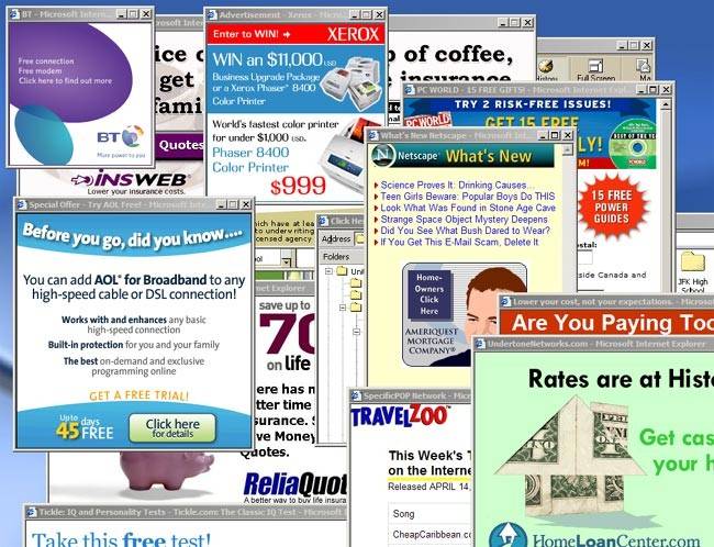
1 810 000 search results of images picturing scary, flashing popups from the 90’s.
I remember it like it was yesterday. The time when everything digital was still scary.
Internet was a safe haven for anonymous pirates, and a hotbed of for digital freedom fighters.
Do you remember?
But…
Now – in 2017 – it is different. Now, most websites use some kind of popup, and it works.
If its not to collect leads, it is to give a discount code, or to drive traffic to a specific page.
Popups has recovered from being blinking ad monsters, to be a natural part of most sites around the world.
If you are one of those who don’t like popups – I understand. I also find it annoying at times.
But, you can’t get away from the fact that popups are one of the most effective ways to grow your e-mail list.
Don’t just take our word for it.
Lars Lofgren is a marketing consultant / Growth Hacker who helped building companies like:
- Dropbox
- KISSmetrics
- Type Form
- Mesosphere
He works with some of the world’s leading companies and people daily, and this is what he says about popups:
“The single best way to drive email subscribers is with a popup. I add one to every business I have because the conversion rates are just too good.”
– Lars Lofgren, Director of Growth @ I Will Teach You To Be Rich
A survey by Aweber also shows that pop ups could give you 1 375% more leads compared to a “regular” newsletter form.
Here’s the results from a cooking blog who replaced their regular forms, with popups:
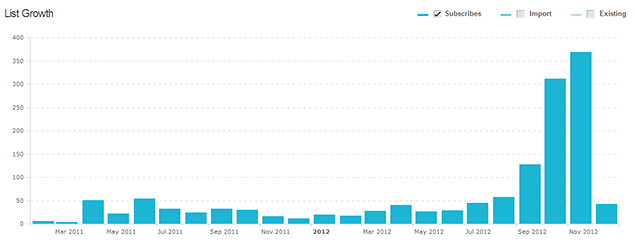
Can you see where they started using them?
When they didn’t have a pop up in place, they collected around 50-25 subscribers per month.
But, as soon as they started using pop ups, their email list started growing quite fast.
In two months, they collected over 850+ e-mail addresses.
Impressive? Yeah.
Many businesses are still afraid that they will scare away their visitors by using pop ups.
I can guarantee you, that it will not happen.
Here’s the truth:
A pop up is not enough to scare away a loyal customer or visitor for life.
If you have an offer that are relevant and interesting to anyone visiting your site, they will take it.
I have yet to find proof that the right kind of pop up, used in the right context, will reduce engagement on your website.
Your bounce rate is calculated based on how many pages a visitor visits.
Generally, you want to aim for a low bounce rate, but it depends on what type of website you have.
For a blog – as in the example above – it’s not uncommon to have over 80% bounce rate.
This is because most people are looking for specific information in the moment.
It could be that they click on a search result, read the blog post and then leave the page.
The graph above shows an example of Brian Dean’s blog, Backlinko.
The faint blue area indicates the period where he switched off all the pop ups on his site.
The result?
The number of new subscribers to his newsletter more or less dropped by 50 %.
Of course, bounce rate is not the one and only metric to look at when measuring engagement, but it’s a good start.
Popups in 2017 and beyond
Google recently released an update about a few changes in their ranking algorithm.
2017 is the year they will prioritise the mobile experience.
Over 60 % of all searches now come from mobile devices.
This means that if your website doesen’t load fast enough, Google considers this a bad experience.
To ensure that the best sites will be ranked as high as possible in search results… “Big G” changed the rules once again.
Google will punish websites that aren’t using mobile friendly pop ups, and those covering large areas of your content.
Regardless of what Google thinks about pop ups, it’s a feature that has always been annoying.
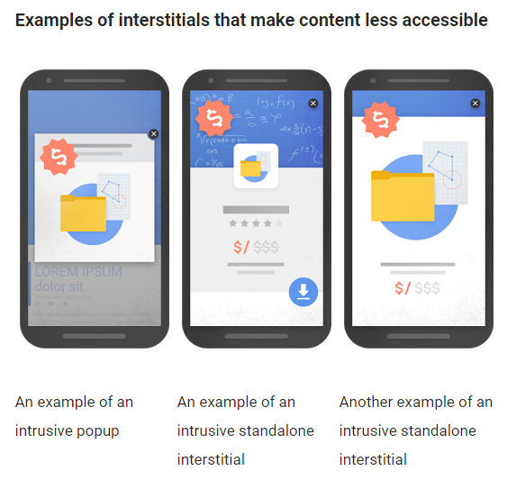
Here are a few examples of what Google does not approve:
- Pop ups that displays instantly when you visit a page
- Pop ups that cover large chunks of the content, and prevents you from reading the information on the page
- “Welcome mats” that are placed above the fold, but inlines the original content below the fold
Google has, as usual, created graphics showing more precisely what they will crack down on:
What you must think about is that this is a small part of Google’s otherwise 100 or 1 000 ranking factors.
The only solution to avoid punishment is that you follow their developer guidelines.
From the perspective of the user, it’s a problem with large pop ups showing up on smaller screens. We’ve all been there and it’s annoying when you have to swipe, scroll or search for the “X” that sometimes almost doesen’t exist.
This is something we take seriously at Triggerbee. That’s why we have developed several alternatives to popups, so that you don’t have to annoy your visitors just to collect their email address.
With that said, here are three reasons why you don’t need to worry about this update…
1. There are very good alternatives to pop ups
Embedded Forms (Approved by Google!)
Content Marketing and SEO goes hand in hand.
Instead of using pop ups on every page, you can collect leads with embedded forms that are placed within the content instead.
Google looooves embedded forms because they are already inlined in the content when the page loads!
The example above shows you how it can look like when you have an embedded form in a blog post.
Although, it’s not the only place where you can use them.
Here’s a few examples:
1. In your footer, to collect subscribers to your newsletter
2. On your product pages – If you run an ecommerce website (ex. “Send me a notice when this item is back in stock”)
3. On a landing page, as part of a registration process.
4. In a blog post
5. In your shopping cart, to be able to e-mail your visitors a discount code.
The list is already long, but as you can see, you can use it almost everywhere with good results.
Callout (Approved by Google!)
It’s no secret that you can create popups that are well-liked by controlling them based on your visitors behavior and interests.
Google says:
“Banners or modules that take up a reasonable area of the screen will not be affected by the new signal.“
In Triggerbee, you can create banners that only cover a small area of your mobile screen, and we call them “Callouts” .
A Callout appears in the bottom right of your screen with a custom message, like this:
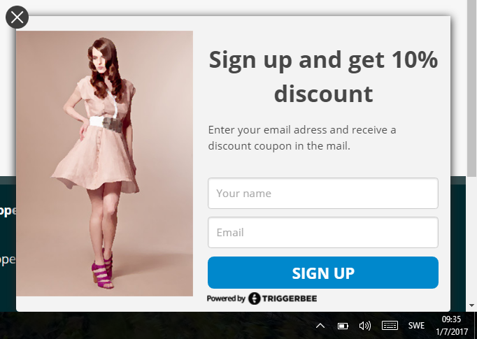
Not only are they friendlier to your visitors, but they also get the thumbs up by Google!
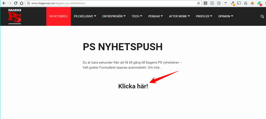
Trigger Link (Approved by Google!)
A trigger link works like a regular popup – but the difference is that it doesen’t appear unless you click on a link.
Since it’s often used when you give away a resource in a blog post, there are many who call this type of link for “Content Upgrade”.
The blogger and marketing expert Neil Patel uses it like this, and you may understand why he calls it a “Content Upgrade”:
Exit Intent (Approved display rule by Google!)
Your e-mail list should always be priority #1.
When it comes to collecting leads on your website, it’s important that you have the right kind of timing and display rules on your widgets.
If you choose to display a popup or a widget on Exit Intent the visitor will not see it until they are about to leave your website.
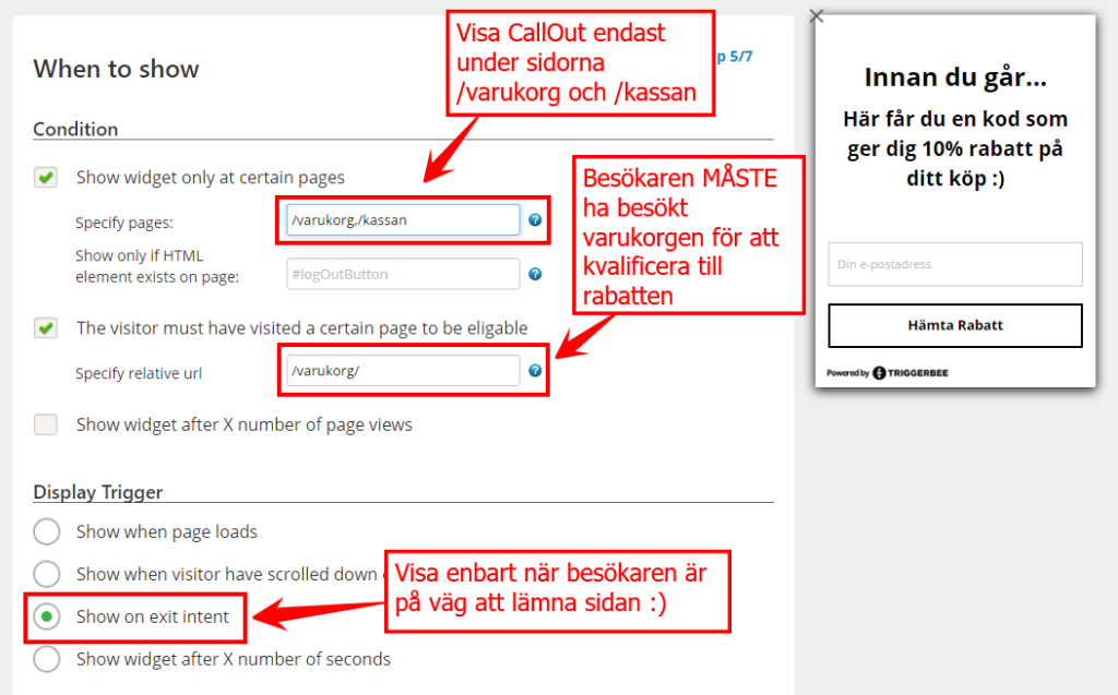
Google doesn’t want your visitors to be interrupted in the middle of their visitor session.
Exit Intent gives you a second chance to reclaim a lost purchase, collect an email address or to provide some much needed discount.
Now we have shown you some options for popups that are all approved by Google and how you can use them.
Most solutions doesn’t meet Google’s guidelines. Whenever you see a solution that is not named Triggerbee, you should always check that they use 100 % mobile-friendly templates.
2. E-mail is the only channel you can control
There are almost an unlimited number of channels that you can use to drive traffic to your website.
Here’s a few of the most common:
1. SEO
The rules for what is OK and NOT OK changes from month to month and all you can do is play along.
You have no control over what Google changes next, and you won’t get away with any black hat tricks, quite the contrary.
You can learn to master the channel and surf a long on the waves, but it is usually a long way to walk.
2. Social media
Facebook and LinkedIn drives the most engaged traffic. The only problem is that they have full control over everything you build on their platforms
If they decide to cut back on the reach or change the rules of the game – you can’t do anything about it.
3. Digital Advertising
Any company providing advertising services could raise their prices or cut down on their reach whenever they want to.
When it comes to email, there is no one who can take away your e-mail list. You can decide what information you want to send out and how frequently – or infrequently – you want to send it out.
72% of all consumers prefer to get offers and business communication via e-mail.
Here are some additional statistics that reinforces this point:
- E-mail subscribers are 3x more likely to share your content via social media than visitors from other channels – Quicksprout
- 64% of marketeers says e-mail marketing and marketing automation contributes to more sales. Even more than an increase in webshop visitors, engagement and better insights into target audience.
- E-mail is 40x more efficient than Facebook and Twitter combined, when it comes to acquiring new customers – McKinsey
3. Google is a business (just like yours)
Last year, over 80% of Google’s revenue came directly from AdWords.
Roughly $60 billion came from their own advertising network.
If you think about it, this is not “only” an update to make mobile websites more easy to navigate,it will also affect their own products.
Google doesn’t want you to build your own platform too aggressively.
Over 90% of all search traffic comes from the results on page 1 and if you live on page 2…
If you have a site that is popular and if you use the right kinds of widgets, or Popups in a responsible manner … you will probably not be affected by this update.
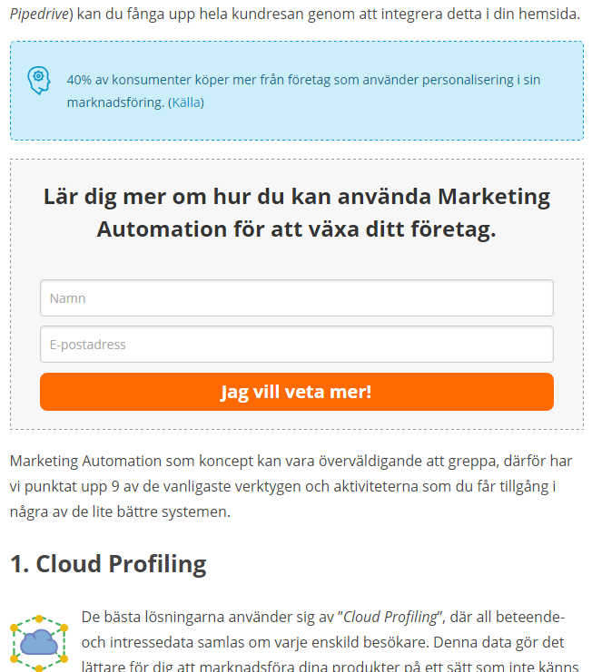
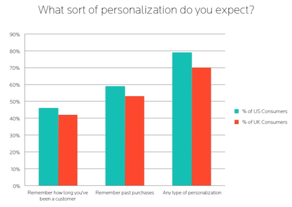
The importance of personification
AgilOne show that over 70% of your visitors expect you to use at least some personalization, based on their behavior.
This also means that you should customize the message in your Widgets to what page they appear on, and to the people that will see it.
As long as you collect e-mail addresses in a way that is not annoying, you will stay dry and safe.
This new update also proves that the timing and how you segment your visitors, are becoming more and more important.
If you can’t give your visitors any personalized offers or recommendations, it’s a solution you want to have in 2017 and beyond.
Your visitors are not stupid.
They are people with survival instincts on high alert, and it’s been like that ever since we lived in caves.
It’s not always about selling as much as possible, many times it’s the experience that leads to the sale.
The thing you must realize is that it’s a two-way street. If you let your visitors show you how they want to buy from you, they’ll let you tag along.
So, in what ways you can control how your popups appear based on user behavior and interests?
Here’s a few examples:
- Exit Intent is a so-called “Smart” display rule that tracks mouse position, speed and movement patterns to show your popup when the visitor is about to leave your home – not before.
- Click on a link – show your popup when someone clicks on a länk.
- Based on visitor interests – show a customized pop-up for a special visit segment. Then you can show your popup only
These display rules are both engaging and effective.
They also let you stay in control over how you choose to grow your email list, and drive traffic.
We call them Widgets in Triggerbee, and it’s a collective name for all our templates.
You can show them based on behaviour, interests, visitor segments and much more.
Many of our clients do an incredible job using different kind of widgets in a way that gives them impressive results.
Not to brag, but the average conversion rate for our widgets are a stunning 4,65%!
Conclusion
Don’t forget that there are alternatives to Popups that can give you the same results, or better!
Now you also know more about the alternatives available, when you can use them, and how you can control them for the best results.
It’s not hard to create widgets that converts well, but it will surely take some time and a few experiments before you find exactly the right combination of copy and offer for your target audience.
Remember this:
If you stick to a plan that you can execute on regularly, you can always go back and analyze what went wrong, and build a new experiment based on that data.
When I sat down to write this post, I started by googling “spam pop ups.”
The result?
1 810 000 search results of images picturing scary, flashing popups from the 90’s.
I remember it like it was yesterday. The time when everything digital was still scary.
Internet was a safe haven for anonymous pirates, and a hotbed of for digital freedom fighters.
Do you remember?