See what you can do when you have integrated Pipedrive into Triggerbee.
It’s 2023 and no one wants to be treated equally anymore.
E-commerce has seen tremendous growth in recent years and most are running on the same technologies and strategies.
How do you stand out in the cutthroat competition?
How do you keep customers coming back to you? Without buying your customers back dearly from Google and Meta. Or chasing first place on comparison services like Pricerunner, with zero margins as a result.
Everyone talks about being data-driven and close to your customers, but what does that look like in practice?
In this post, I look ahead at trends in personalisation for 2023.
1. Owned target audiences and zero-party data
Investing in owned audiences is by far the most important thing you can do for your business and many companies are already running customer clubs etc.
The data that companies collect based on how the customer acts in the relationship with the business, such as completed purchases and behaviour on the website is usually referred to as first-party data.
Information that the member owns and voluntarily gives away in order to have a better shopping experience is called zero-party data.
For example, as an e-merchant, you collect customer data on age, favourite brands, interests, clothing/costume size, skin type, etc.

The information may be collected through, for example, the membership page, forms, competitions or surveys.
If you don’t actively have a strategy for collecting and working with zero-party data, now is the time to do it. Data is the new gold. Purchase history is old information. Zero-party data is forward-looking and the number one strategy you can apply in 2023.
Examples of companies: Triggerbee, Wunderkind, Sleeknote, Intercom
2. Personalised product descriptions via NL/GPT
Imagine product descriptions for thousands of products, written uniquely for each customer. This is now not just a fantasy but a reality with services like GPT (Generative Pre-trained Transformers).
Surely you like everyone else are incredibly impressed by GPT-3 but in 2023, GPT-4 is expected which will be greatly improved led 100 times more data parameters. However, GPT-3 is already good enough to generate really cool product descriptions in any language.
Olof, these rubber boots go great with your newly ordered raincoat! Perfect for when the autumn storm rolls in over Stockholm.
For your MacBook Pro 14″ you will need this 90W charging adapter with USB-C connector.

Examples of companies: OpenAI, Hauptik, Deepmind, Sobolt
3. Strategic segmentation strategy
With today’s CDP solutions, you can create hundreds of segments, but achieving effective personalization with too narrow segments can require too much work in set-up and content creation. Consider which segments you are most likely to be profitable with and define these in your CDP for use across all channels.
Examples of companies: Voyado, Infobaleen , Rule, Custobar, Emarsys
4. Augmented Reality
The use of AR/VR in e-commerce is a trend that has grown stronger recently. These technologies allow users to “try on” products in a realistic way, by displaying the product in their own home or by virtually trying on clothes before purchase. When consumer uncertainty is reduced, the chances of a purchase increase.

The technology is still somewhat immature and it may be a while before we see it take hold in Sweden, but it’s definitely an area to keep an eye on!
Company example: Fibbl
5. Personalised offers and promotions
One trend is to work with personalized offers and promotions. By using data about users’ behaviour and previous purchases, companies can send out offers and promotions that are tailored to the individual user. This could mean offering a coupon on a product the user has shown interest in in the past or sending out a special offer on their birthday.
By controlling who gets access to discounts, you can build loyalty with the right segment, without losing too much margin.
Examples of companies: Triggerbee, Wunderkind, Yieldify
6. Conversational commerce
Another important trend is the use of chatbots and virtual assistants. These tools can be used to help users with everything from finding the right product to managing orders and returns.
Chatbots and virtual assistants can also be used to collect data on users’ preferences and behaviour, enabling retailers to create a more personalized shopping experience.
Examples of companies: ebbot, soultech, giosg
7. Personalisation of email
Email personalisation is of course a given in 2023. Examples of email personalisation include personalised product recommendations, content and texts tailored to the recipient’s preferences regarding brands, colours, prices, additional services and more.

Companies that successfully implement this will have higher engagement, open rates and higher ROI. Given the changes in iOS updates, you’ll have to look less at open rate, and instead focus more on other elements of engagement, such as clicks and onsite activity.
Examples of companies: Voyado, Rule, Custobar, Emarsys, Klaviyo
8. Adaptive content
Adaptive content adapts and delivers content to individual users based on their preferences, location and other data points.
Content on the website can be adapted based on the user’s context and preferences. Videos can be generated, including, for example, the user’s name.
Examples of companies: Triggerbee, SEEN (video)
In summary
2023 is the year when personalisation becomes a critical differentiator for most businesses.
Do you have a trend that I missed?
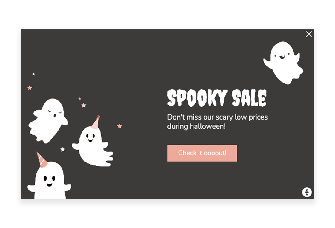
Fullscreen Halloween Campaign
During Halloween, visitors got a spooky surprise on the Frank Dandy website. They used Triggerbee to create a Halloween-themed fullscreen campaign with the aim of increasing purchases. With a staggering result of ~40% copied discount codes, they managed to strike the balance between having a big creative campaign, and still keeping the site user-friendly.
Their goal was to increase purchases by offering a 50% discount code. Out of the copied codes, ~20% of those were actually used to purchase products on their site.
“It was great fun to make a really big Halloween sale in a nice fashion. And it looks like our customers agree since the results were great!” – Gustav Bolinder, E-Commerce Manager
Black Friday is right around the corner, which means it’s time to start thinking about how you can drive more sales than ever before.
If you’re looking for some inspiration about how to do just that, you have come to the right place.
In this article, we will show you 5 effective strategies that will help you grow your list, and capture potential customers in the weeks leading up to Black Friday, that is ready to spend money as soon as your announcement goes out.
Let’s dive right in (our favorite is strategy no. 4).
Gamification – Spin-the-wheel
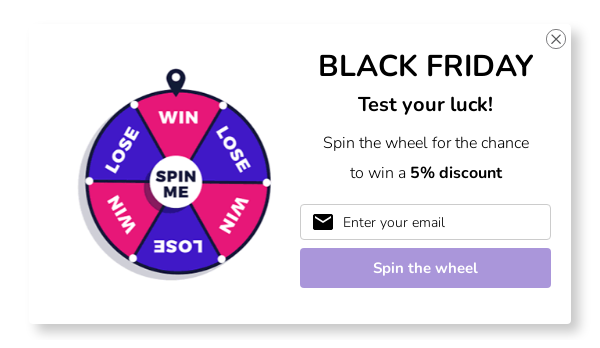
Gamification is the use of game mechanics and game design principles in non-game contexts to drive engagement and loyalty. That’s a mouthful, I know.
In simple terms: Gamification means taking something that’s traditionally considered fun (like playing a game) and using it to achieve a business goal (like increasing sales).
There are a number of ways to gamify your black Friday campaign, but one of the most effective is to use a spin-the-wheel type popup.
People love to spin wheels because:
- It creates a sense of excitement and anticipation.
- It’s suspenseful. No one knows exactly what they’ll get when they spin the wheel, which sparks curiosity (ever seen someone walk away after spinning a wheel? No? Me neither.).
- It’s rewarding. Your customers feel like they’ve won something when they receive their prize (which is usually a discount).
A spin-the-wheel popup incentivize people to take action, while also helping you collect valuable data that you can use to improve your marketing strategy going forward.
But the best part? Spin-the-wheel popups have a significantly higher conversion rate than normal popups – between 5% – 20%.
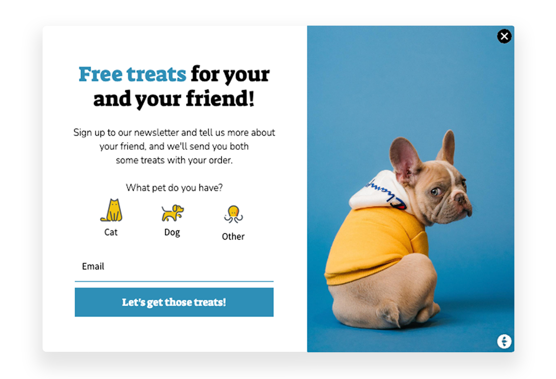
Refer a friend
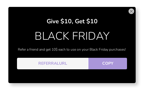
Referral campaigns are not that common with e-commerce brands, but they are incredibly effective (when done right). Referral marketing was one of the biggest growth levers for companies like PayPal, Netflix, Rent-a-Runway, and AirBnB when they started out.
Almost all referral campaigns use two main strategies (or approaches):
- Give a bonus incentive to the referrer
- Give a double-sided incentive to both the referrer and the referred customer.
What’s most effective for YOU depends on the occasion and the reason why someone is referring someone else. But keep in mind that discounts or fixed cart discounts (cash) are the most popular and proven strategies when it comes to referral marketing.
The best part is that you can tweak the offer in many different ways. You don’t have to give away a discount or cash incentive. You can offer a free sample, a special present, or points and credits if you have a loyalty program, and you can even set a spending limit before the incentive is active (not recommended, but possible).
This means that even if you have a brand that does not give out discounts, you can still run a successful referral program.
However, keep in mind that the success of your referral program is highly dependent on relevance and “What’s in it for me”.
Relevance = Targeting
What’s in it for me = Incentive / Offer
Relevance
You probably don’t want every website visitor to be prompted with a question to refer a friend. That would be the equivalent of running a global Instagram or TikTok ad campaign with no targeting – and you SURELY wouldn’t do that, right?
Preferably, you would want to create a segment in your CRM that are highly likely to act on this offer, and then target them with this message when they visit your website. Customers with a high loyalty status, people who previously have referred a friend, or customers with a high average order value are great audiences to target.
If you use Triggerbee you can easily target segments and audiences from your CRM on your website with personalized offers and messages.
What’s in it for me (win-win-win)
Keep in mind that your target audience doesn’t want to feel targeted or used. They don’t automatically want to refer your brand to their friends… unless they get something in return. Running a referral program without an incentive is like attempting to fly a kite just by blowing at it.
So, make sure you have an incentive that people actually want.
A special Black Friday bonus offer (for customers who make a purchase of a certain amount or more)
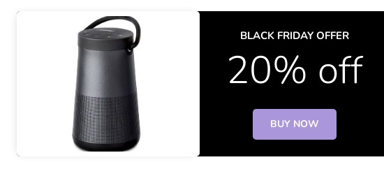
Bonus offers can take many different forms, but they all have one goal in common: to get people in the door (online) and spend money.
Some common examples of Black Friday bonus offers include:
• Discounts on specific items or categories of items
• BOGO (buy one, get one) deals
• Free shipping offers
Offering Black Friday Bonuses for people who spend more can help you stand out from the competition, and save your margins.
With so many businesses competing for attention on Black Friday, anything you can do to make your business more appealing to shoppers is a good idea.
Second, a Black Friday bonus offer can help you attract new high-value customers. If you offer an incentive that’s too good to pass up, people will want to give your store a try.
And finally, a Black Friday bonus offer can help build goodwill with your existing customers.
Run a gift-card giveaway in the weeks leading up to Black Friday or Black Week
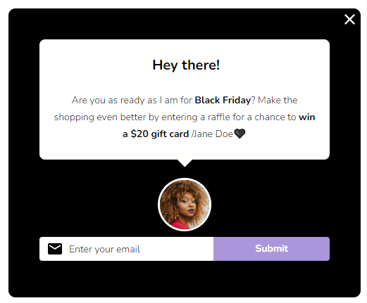
Contests and giveaways are a great way to drive sales during the holiday rush. They create excitement and buzz around your store, and they give people an incentive to shop with you.
I know what you’re thinking. “We’re already discounting everything – why should we give away MORE?!”
And here’s the best part about gift card giveaways:
You can set a cap on the number of gift cards that you give away. But keep in mind that the amount of gift cards that you “should” give away is directly related to the value of each gift card.
If you give away a gift card worth $1,000, it’s reasonable to only give away one. However, if you give away gift cards worth $10, it’s not reasonable to only give away one. It’s just not enough to spark any interest.
With that being said, here are three things you need to consider:
- Make sure that your prize is something that people actually want.
- Promote your contest or giveaway widely so that people know about it and have a chance to enter.
- Make sure that your contest or giveaway rules are clear and easy to follow.
If you can do all of those things, then you’re well on your way to running a successful contest or giveaway.
But what if you want to take things one step further? What if you want to really knock your Black Friday sale out of the park?
Here are a few additional tips:
- Get creative! Instead of giving away a generic prize like a gift card, try to come up with something more unique and specific that will appeal to your target audience. For example, if you’re a clothing retailer, you could give away a $500 shopping spree on Black Friday. Or if you have an electronics store, you could give away a new TV or gaming console.
- Make sure your contest or giveaway is relevant to your brand. This may seem like an obvious point, but it’s important to make sure that your contest or giveaway fits in with your overall brand identity. For example, if you’re known for being an environmentally-friendly company, you could run a contest or giveaway where the prize is an eco-friendly vacation package.
- Use influencers for maximum impact and reach. If you’re a seasoned influencer marketer, you already know how powerful it can be to get your brand in front of other people’s audiences. Instead of doing what EVERYONE ELSE is doing leading up to Black Friday, use influencers to promote YOUR Black Friday contest!
- Have some fun with it! Black Friday can be a stressful time for both retailers and shoppers alike. So try to inject some fun and excitement into your contest or giveaway by coming up with creative ways to promote it and making sure that everyone who participates has a good time doing so.
Give existing customers a sneak peek at the Black Friday sales to come
A great way to get your customers excited about your Black Friday sale is by giving your existing customers a sneak peek at what’s to come.
This way, they can start planning their shopping lists and budgeting accordingly (they are already doing that). Plus, it’ll build up a sense of anticipation and excitement for the big day.
Here are a few tips for how to do this effectively:
- Create a segment of the most loyal customers in your CRM or email list. Then send out an email a couple of weeks before Black Friday with some of the deals you’ll be offering. Be sure to include a few doorbusters that will really get people excited, and don’t be afraid to re-send emails to the subscribers who did not open your email.
- Build a landing page with a countdown timer, showcasing some of the deals and categories that will be discounted.
- Incorporate it into your social media strategy and include a link to your website so people can start browsing early. You could even run a social media contest leading up to Black Friday where people have to guess what the doorbuster deals will be.
- Use influencers to get maximum exposure. If you have continuous collaborations with some influencers, make sure they let their audience know about some of the deals in advance. You could even let an influencer pick out the deals he or she might like best, and ask them to promote those to their followers.
- Put up a banner on your website with a countdown until the sale starts. This creates a sense of urgency and gets people clicking through to see what deals they can expect.
20 ready to use examples for Triggerbee Campaigns
Once upon a time, popups and onsite widgets were merely used for hunting newsletter subscribers with broad messages without any real thought behind it (except collecting subscribers of course). But as the internet and digital sphere evolve, so does our way of working with it. Today, there’s a great need for personalization and relevance when browsing online shops – and it’s up to you to meet your visitors’ demands.
I am sure many eCommerce businesses out there are still stuck in the intrusiveness of newsletter popup spamming – but don’t worry – I’m here to help you out! Keep on reading to find out 20+ use cases for working with onsite campaigns on your website. The newsletter popup will definitely be there as well – it’s a great approach to collect subscribers – just make sure to target it accurately. If you’re short on time – simply browse all the beautiful inspirational images throughout the guide (that’s what I usually do myself).
Anyway, no time to waste – let’s get started with enhancing your personalization journey!
PS. All the examples in this guide are of course created in Triggerbee – what else could it be? They are all available as ready-to-use templates in the app!
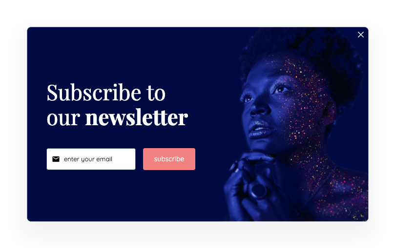
List building with discount
Having a newsletter signup is more or less a requirement for eCommerce businesses these days. To make the most of this signup, businesses usually offer some type of incentive to get the visitor to convert. The most common motivation is a percentage discount on their purchase, usually 5-15%. Consumers are more likely to subscribe to a newsletter if they know that they can get a discount or some other win for doing so.
Target audience: New or unidentified visitors
List building without discount
Some of you eCom business out there doesn’t want to work with percentage discounts. If you are one of them, a good option is offering something more static – like free delivery, a specific amount of discount (eg. 5€), or other incentives that don’t vary depending on the total order value. This will keep the sense of urgency and encourage people to act quickly, without eating up your margins.
Target audience: New or unidentified visitors
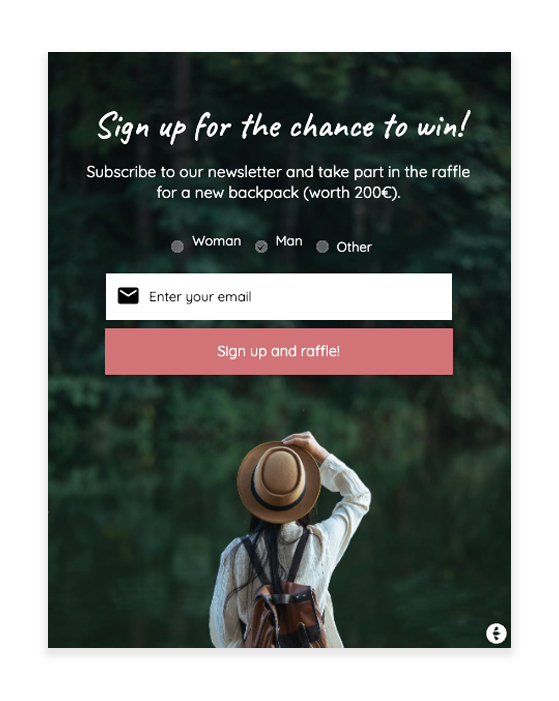
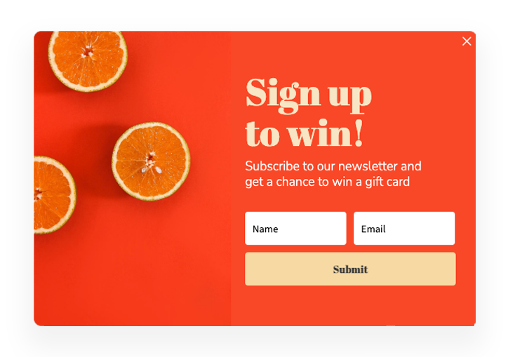
Competitions and Raffles
If there’s anything that everyone likes, it’s the chance to win something. You can take advantage of this by using contests or raffles in your signup. Common things to raffle are gift cards, coupons, or products. Raffles are exciting and fun, and we can guarantee that they will boost your newsletter conversion rate.
Target audience: New or unidentified visitors
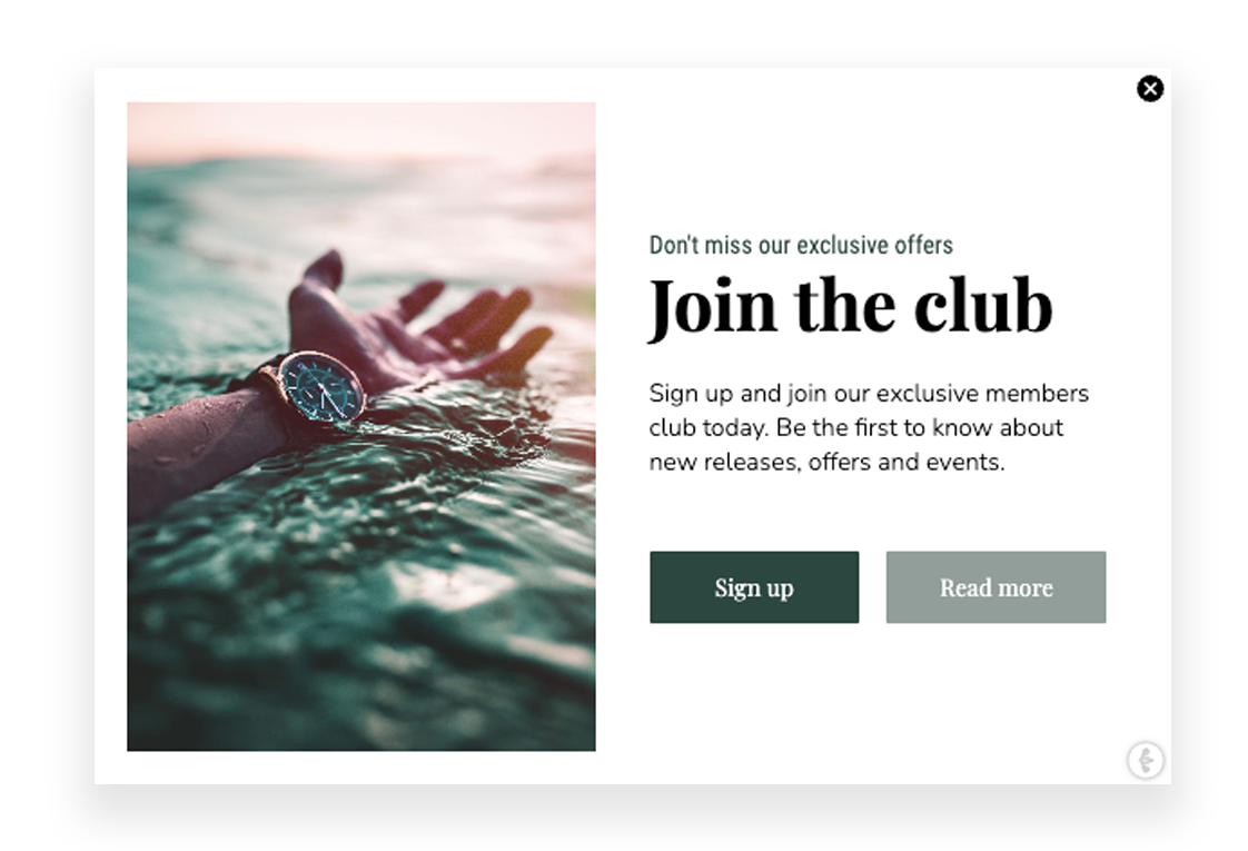
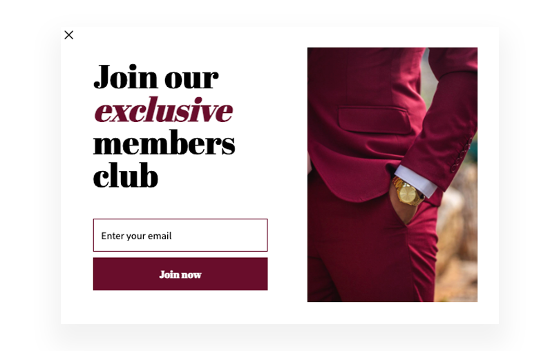
Collect members to your “exclusive” club
Another approach to having a signup without specific discounts or offers is offering something exclusive. Limiting access to certain content or features on your site can encourage more visitors to sign up for the newsletter. The sense of exclusivity creates a feeling of urgency and encourages visitors to “join the club” and give you their email right away. Having an exclusive membership “club” also helps to build a stronger relationship with your customers and encourages them to return to your website in the future.
Target audience: New or unidentified visitors
Influencer Welcoming
If you are working with influencer collaborations – they usually have a UTM-tagged link that leads to the site (if you don’t UTM-tags, start doing so ASAP). By creating campaigns targeted to those UTM tags, containing the same offer that the influencer is announcing – you will create a sense of unity between the channels. At the same time, you will make it easier for the visitor to quickly grab that discount the influencer is offering. Win-win!
Target audience: Visitors coming from specific UTM links
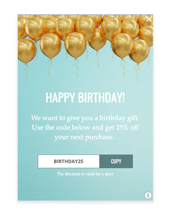
Birthday Wishes
The best thing about connecting Triggerbee to your CRM is that you will be able to use all data you have in your CRM on the website. One of the many use cases with this is that you will be able to congratulate your customers on their birthdays when they are visiting the website. A perfect way to catch their attention and give them a something little extra on the big day!
Target audience: Members in your CRM with upcoming birthdays
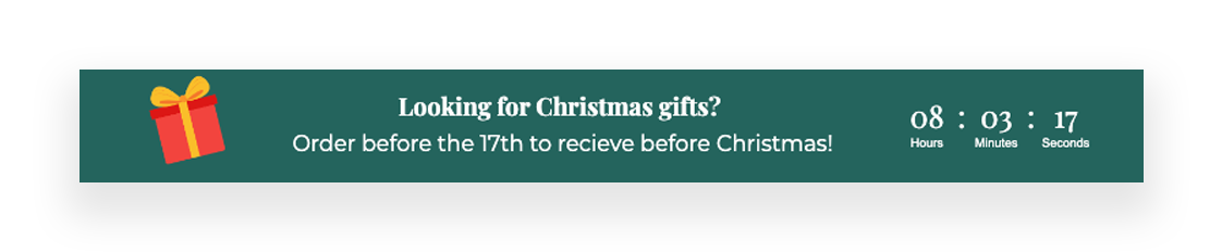
Delivery Counter
If you have a specific date or time that orders have to be made in order to be delivered on time, you can use this to set clear customer expectations. If you tell customers that orders placed by 3 pm will be delivered the next day, they will likely be happy with that. But if you don’t set any expectations and then orders placed at 3 pm are not delivered until two days later, customers will be disappointed. By using a counter, you are setting clear expectations for customers and letting them know exactly when they can expect their order to arrive.
Target audience: All visitors visiting a product page
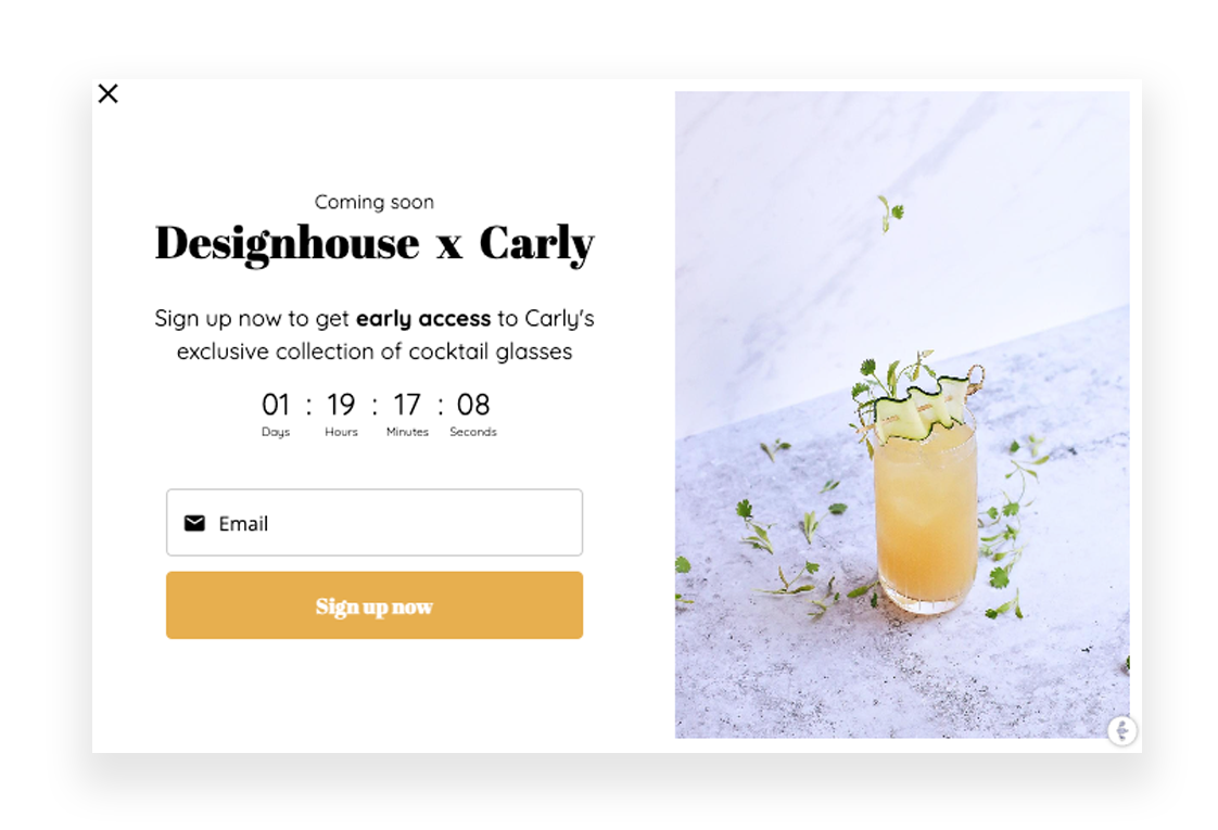
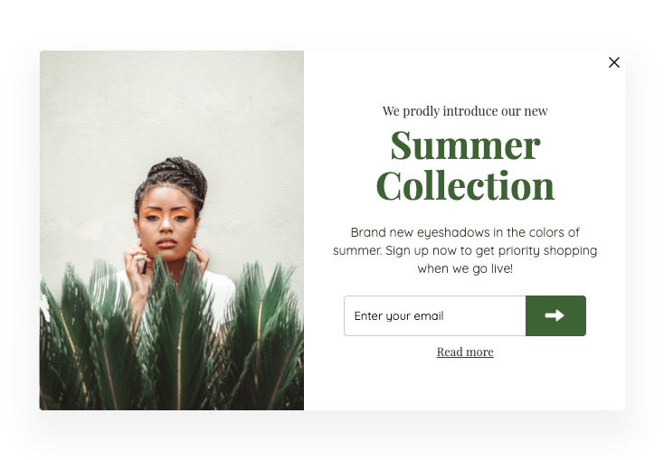
Pre-launch
A pre-launch campaign is a great marketing strategy to generate interest and excitement for a new product or service before it is launched. This allows you to build anticipation and collect important data about your potential customers before the launch. Pre-launch campaigns usually give really good conversion rates and engagement!
PS. Add a deadline component to add some extra FOMO.
Target audience: New or unidentified visitors
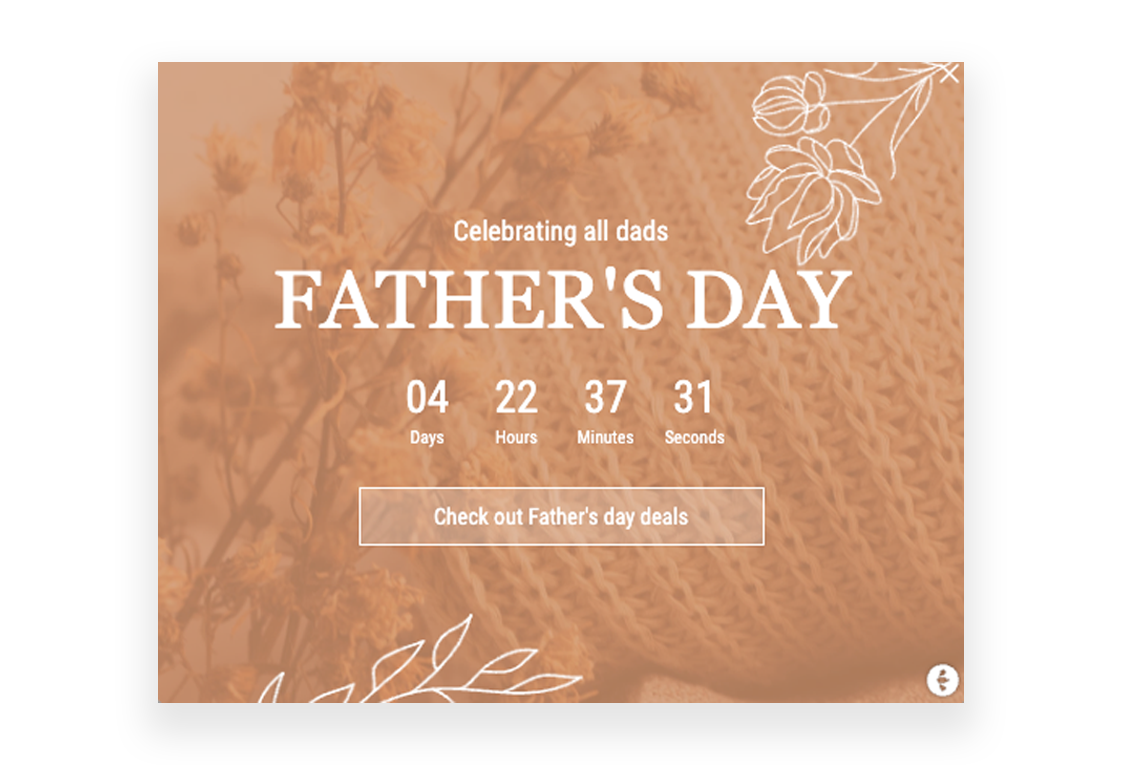
Campaign Counter
You’ve likely heard of the term “FOMO” before. It stands for Fear Of Missing Out, and it’s a feeling we’ve all experienced at one time or another. Maybe you FOMO-ed when tickets to that concert you really wanted to see sold out before you could buy them. If you’re looking for an effective way to boost sales, look no further than the power of FOMO.
If you have a sales campaign running for a specific amount of time, you can use a deadline component to display how long the offer is valid – creating FOMO in an instant.
Target audience: All visitors
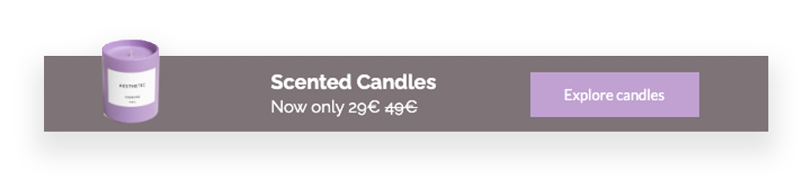
Push Product Sale
Sales can be a great way to move inventory, attract new customers, and boost your business. No matter the reason for the sale, make sure your sales are well-advertised on your website to encourage customers to add more items to their carts and boost your overall sales. Customers also love to see how much they’re saving, so make sure to include the original price and the sale price for each item.
Target audience: All visitors
Push Category Sale
Customers love a good deal, so featuring category sales is a great way to create a sense of urgency and drive conversions. By prominently displaying the savings, you can encourage customers to take advantage of the deals before they expire. You also want customers to be able to find the sale section easily so they can browse through all of the great deals. So what are you waiting for? Start promoting those sales today!
Target audience: New or unidentified visitors
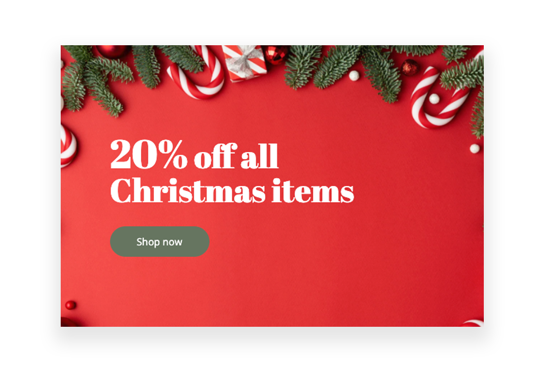
Push Seasonal Sale
Simply putting items on sale is no longer always enough to attract customers. In order to stand out in a crowded marketplace, brands need to get creative with their sales campaigns. One way to do this is by incorporating seasonal themes. Seasonal themes can help you connect with customers emotionally and add some personality to your brand. Just make sure that your theme is relevant and eye-catching, and you’ll be well on your way to driving more sales this season!
Target audience: All visitors
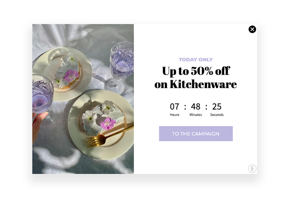
Time-limited offers
FOMO is a powerful emotion—one that eCommerce brands can harness to boost sales. By creating a sense of urgency and scarcity in a certain offer, you can tap into people’s natural feelings of insecurity and motivate them to take action before it’s too late. So if you’ve got a big sale coming up, don’t hesitate to harness the power of FOMO in your campaigns! All you need to do is add wording like “time-limited offer” or “today only” – together with a deadline component. It’s as easy as that!
Target audience: All visitors
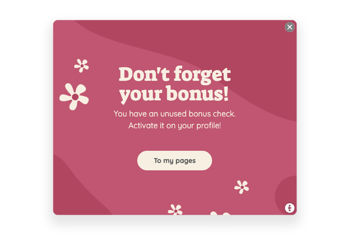
Remind members about loyalty offers
As an eCommerce business, you want to encourage customer loyalty. You offer loyalty programs and incentives to keep customers coming back to your site. But what happens when those customers don’t use their loyalty points? Actually, it opens up a great opportunity to remind them! Surely, you already do this via email and maybe postal, but what about your website? Reminding customers about their offers while on site, already in shopping mode will surely boost your sales. Even if they don’t take advantage of the offer right away, they’ll remember that your company is generous with its loyalty rewards.
Target audience: Members in your CRM with unused member offers or discount codes
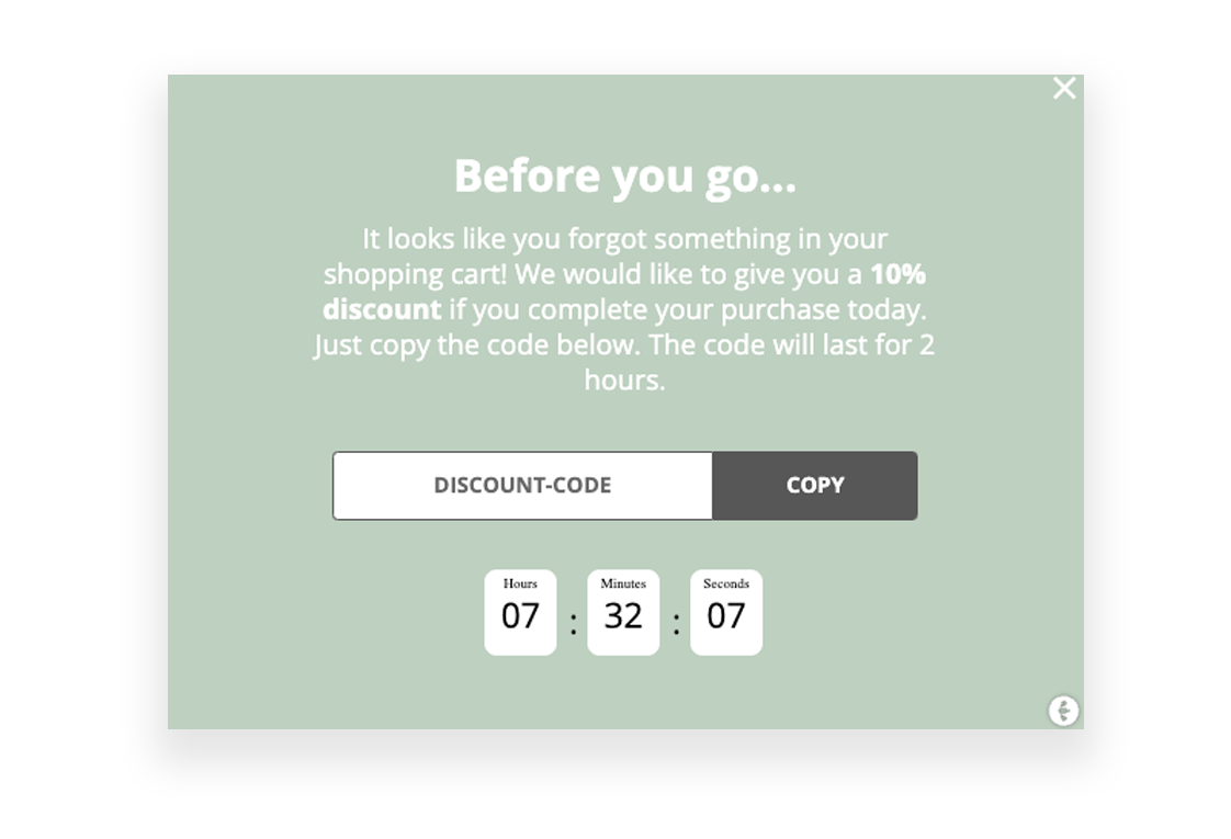
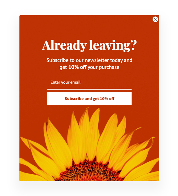
Exit Intent Campaigns
If you’re looking for a way to boost your eCommerce sales, then look no further than exit intent campaigns! These campaigns are easy to set up, highly effective, and versatile enough to be used for any number of purposes. An exit intent campaign is a type of marketing campaign that is triggered when a visitor tries to leave a website. Exit intent campaigns can be used to offer discounts, coupons, or free shipping in order to entice the visitor to stay on the site and make a purchase. They can also be used to capture email addresses for future marketing efforts.
Target audience: New or unidentified visitors with products in their carts
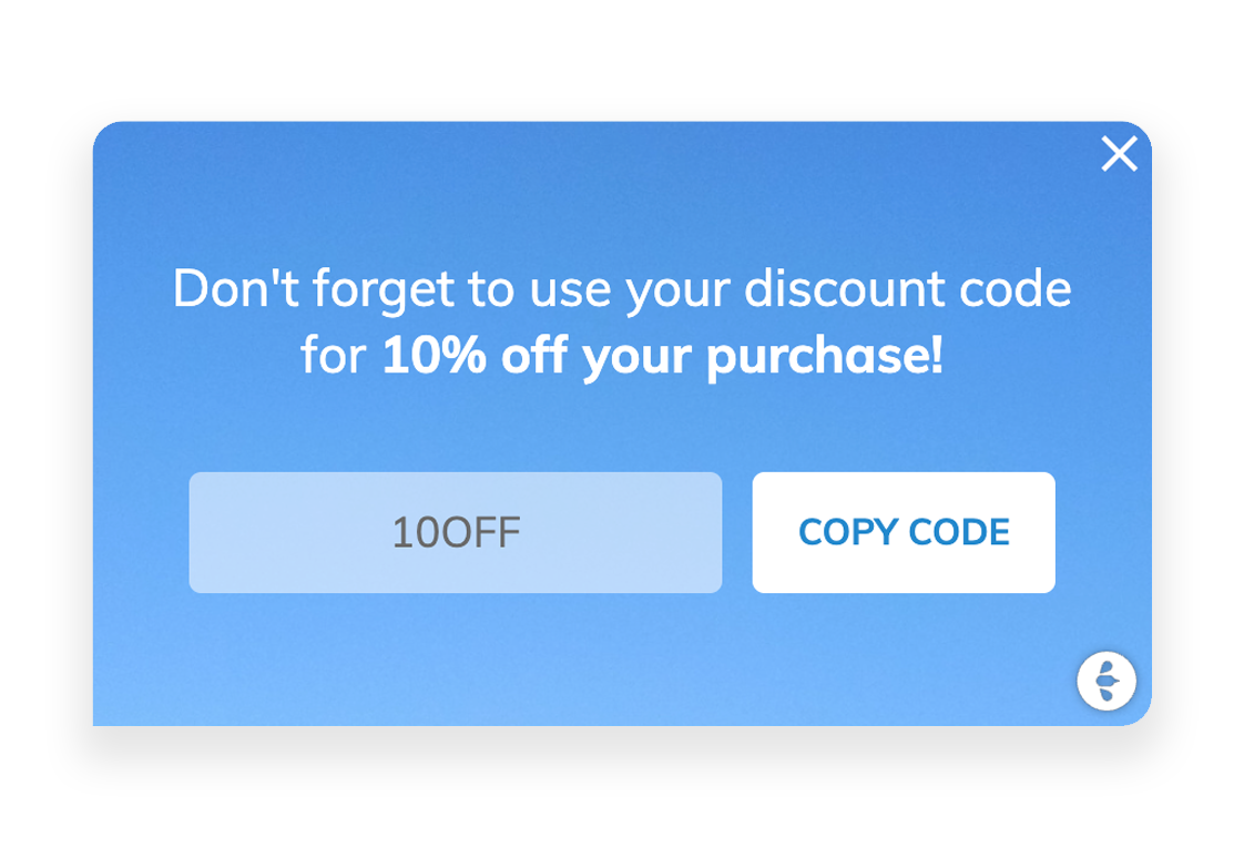
Discount Code Reminder
If you’re not reminding your customers about their unused discount codes and rewards, you’re leaving money on the table. Automated reminders can help you boost sales and keep your customers coming back for more. If a customer feels valued and appreciated by your company, they’re more likely to continue doing business with you in the future.
Target audience: All visitors that recently signed up and got a discount code that they haven’t used
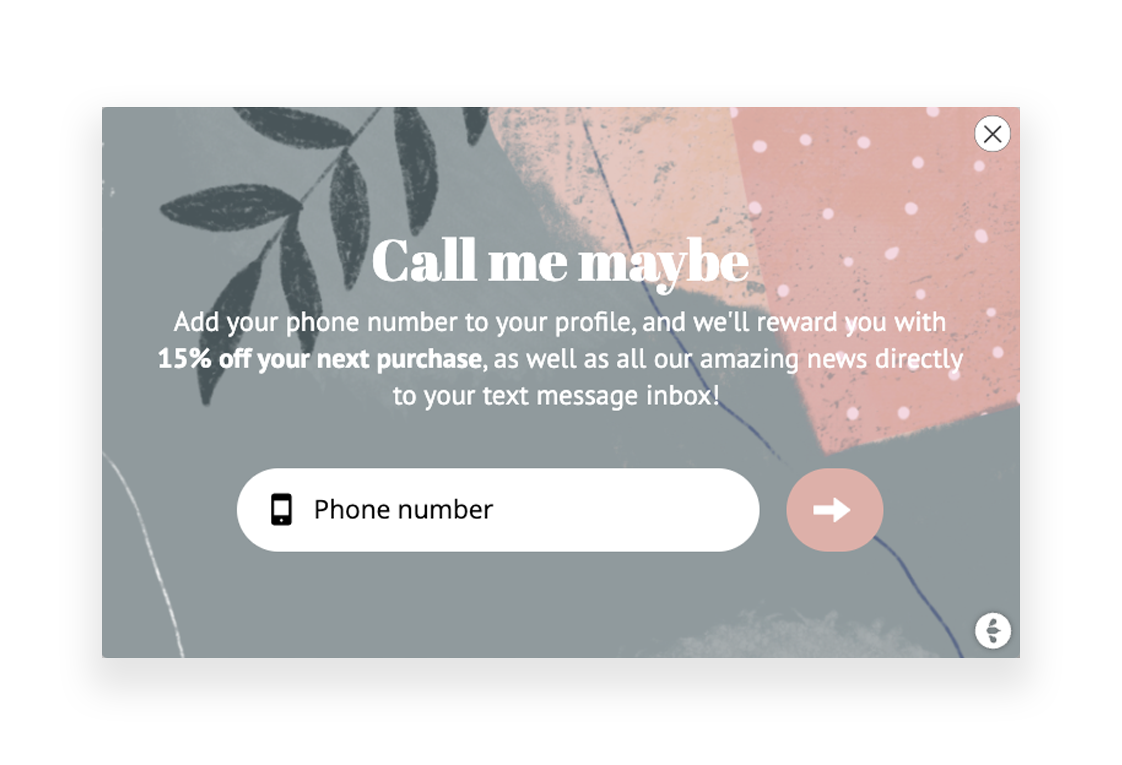
Enrich members with more data
In today’s digital world, data is everything. It helps businesses make more informed decisions, understand their customers better, and create personalized experiences that result in increased sales and brand loyalty. Usually, you would start by collecting email addresses for your newsletter list or membership program. But you shouldn’t stop there, keep collecting more data! For example, ask them for their phone number, gender, birthday, and other preferences. This will allow you to segment more effectively, and ultimately – sell more!
Target audience: Members in your CRM missing the data you want to collect (phone number, email, interests etc.)
Guides
Once you’ve got potential customers on your website, how do you convince them to actually make a purchase? One way to do that is by using product guides. A product guide is simply a type of content that showcases your products in use and highlights their key features and benefits. By creating high-quality product guides, you can give potential customers the information they need to make an informed decision about whether or not to buy one of your products. Triggerbee helps you to push those guides to the right visitors!
Target audience: All visitors browsing the category page for which you have a guide

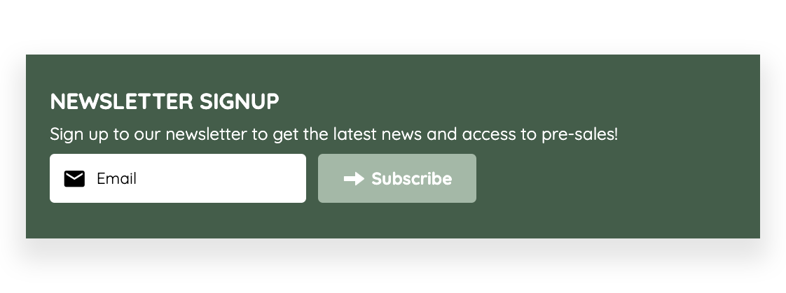
Embedded Footer Signup
No matter if you are collecting newsletter subscribers, members, or log-ins – making the form accessible is key to converting visitors. One great way to achieve this is by having the signup in the footer of your website. Whenever someone is looking for signups, they usually scroll down to the footer because that’s where it usually is. If you don’t have accessible signup there, you are missing out! Also, with Triggerbee – it is possible to personalize the sign-up, displaying different content for new vs. returning visitors.
Target audience: Unidentified or new visitors (plus! change the content of the signup for identified visitors, eg. ask for their phone number)
UTM targeted campaigns
When advertising online, the links to your website are usually UTM-tagged. This opens up a great opportunity to create unity between your ads and your website. If a visitor clicks on an offer in an ad, they expect to be met with the same offer on-site. Simply adjusting images and copy based on incoming UTM tags will quickly unite your channels and likely boost your sales.
Target audience: Visitors coming from a specific UTM link
Invisible personalization is a term used to describe the act of customizing a user’s experience without them being aware of it. While this may sound like a daunting task, it’s actually not as difficult as it seems. By leveraging data and using various techniques, you can easily create a customized experience that will feel less intrusive for your users. One of those techniques is using embedded campaigns.
Embedded campaigns are injected onto your site rather than laying on top like popups or panels, to enhance the feeling of the campaign being a part of the editorial content. Embedded campaigns can be placed anywhere on the website depending on your needs and possibilities. But there are some placements that we always recommend to use for embedded campaigns.
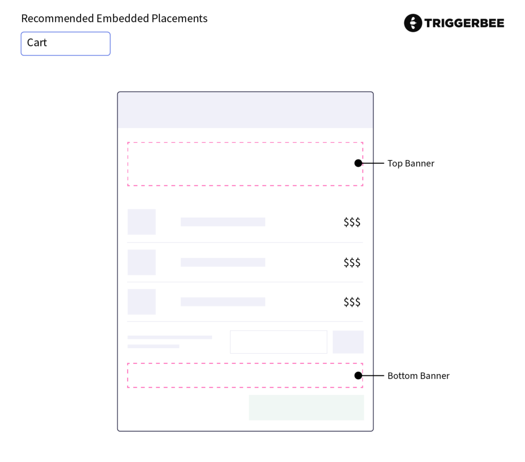
Cart:
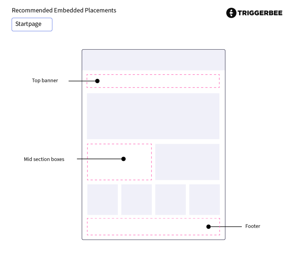
Startpage:
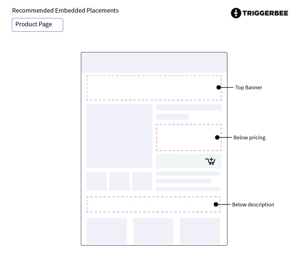
Product Page:
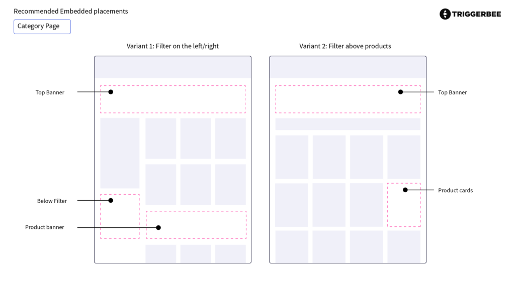
Category Page:
So, there you have it. Our recommended ways to place embedded campaigns. We hope that this information helps you create successful and engaging, yet unintrusive, experiences for your customers. Give it a try!
This article will go over the key steps to creating a converting popup for your website. It will include a list of things you need to do in order to be successful with your popup onsite, including some tips on what to do and what not to do. Let’s get started!
1. Offer Incentives
People are more likely to subscribe to a newsletter if they are offered an incentive. This could be in the form of a discount for future purchases, exclusive access to sales, a raffle for a gift card, or early notification of new arrivals. Whatever the incentive may be, make sure it is something that your customers would find appealing.
2. Be Clear About The Benefits Of Subscribing
It is also very important to be clear about the benefits of subscribing to your newsletter, as well as the expectations of its contents. Let customers know what they can expect once they become subscribers and what they will get out of it. The more convincing you are in your copy, the higher the conversion rate!
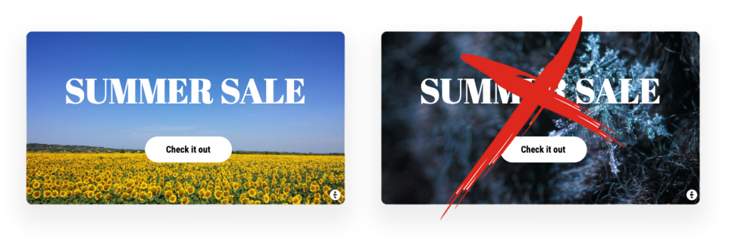
3. Use eye-catching and relevant images
Using engaging and creative images in your popup is a great way to capture the attention of your visitors. You should use images that are related to the content of your newsletter or your brand, or you could go crazy with humorous images that will make people want to learn more about what you have to offer.
4. Make the offer tempting (FOMO)
FOMO, or the fear of missing out, is a powerful psychological tool that can be used to encourage customers to convert. When people feel like they might miss out on a great opportunity, they are more likely to take action in order to avoid missing out. This can be a powerful tool for conversion, as it encourages customers to take advantage of your offer before it’s too late. By using FOMO to your advantage, you can encourage more customers to convert and take advantage of your offer.
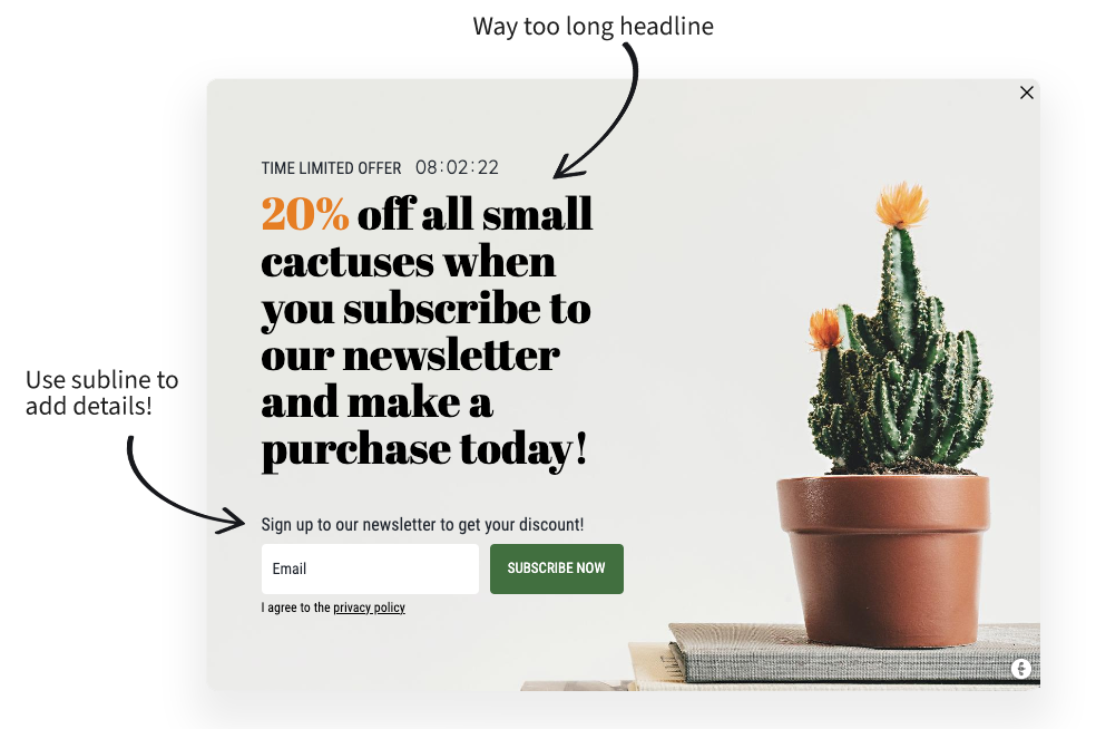
5. Keep it short and simple
If you want website visitors to subscribe to your newsletter, you need to keep your popup form brief and concise. One headline and a short subline are enough; only include the most important information about what you have to offer. Avoid long paragraphs and explanations, get to the point quickly!
6. Be compliant
Make sure to get your compliance in place, to have all the consents you need in order to communicate with your subscribers in that country or area. Better safe than sorry! Checkboxes are only needed if you’re not clear as to what the visitor is subscribing to.
7. Design
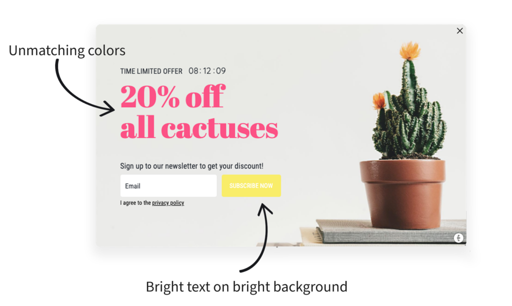
It is important to match the design of your popup with the design of your website. Use the same color scheme, font families, and shapes. If you are using round buttons with a hoover effect on your website, make sure to do the same in your popup. If you don’t have a graphical profile, you should at least match colors in the popup, eg. the color of your image and any buttons should be the same. This is the key to creating that native feeling of your popup and not scaring the visitors.
8. Personalize The Experience
Last but not least – personalizing the customer experience is a great way to increase conversion rates. This means using their name, targeting offers based on their purchase history, or providing them with customized content based on their interests. Personalization helps create a connection between the customer and the brand, which can lead to higher conversion rates.
Newsletters are a great way to keep in touch with your customers and to keep them up-to-date on your latest promotions, products or services. Some might say that email is the number one channel for customer acquisition. However, not all customers will check your website for the newsletter signup on their own. That’s where newsletter popups come in handy.
Newsletter popups are a great way to grab the attention of your customers and remind them to subscribe to your newsletter. They provide an easy way for your visitors to sign up for your mailing list and stay up-to-date on your latest offerings. By using a newsletter popup on your website, you can increase your subscriber base and keep your customers engaged with your brand.
If you’re not currently using newsletter popups on your website, now is the time to start. They are the easiest way to boost your marketing efforts and improve customer engagement and website conversion rates.
Remember, no matter which type of popup newsletter you choose, make sure that it is mobile-friendly. More than half of all internet traffic now comes from mobile devices, so it is essential that your popup newsletter looks good on ALL devices.
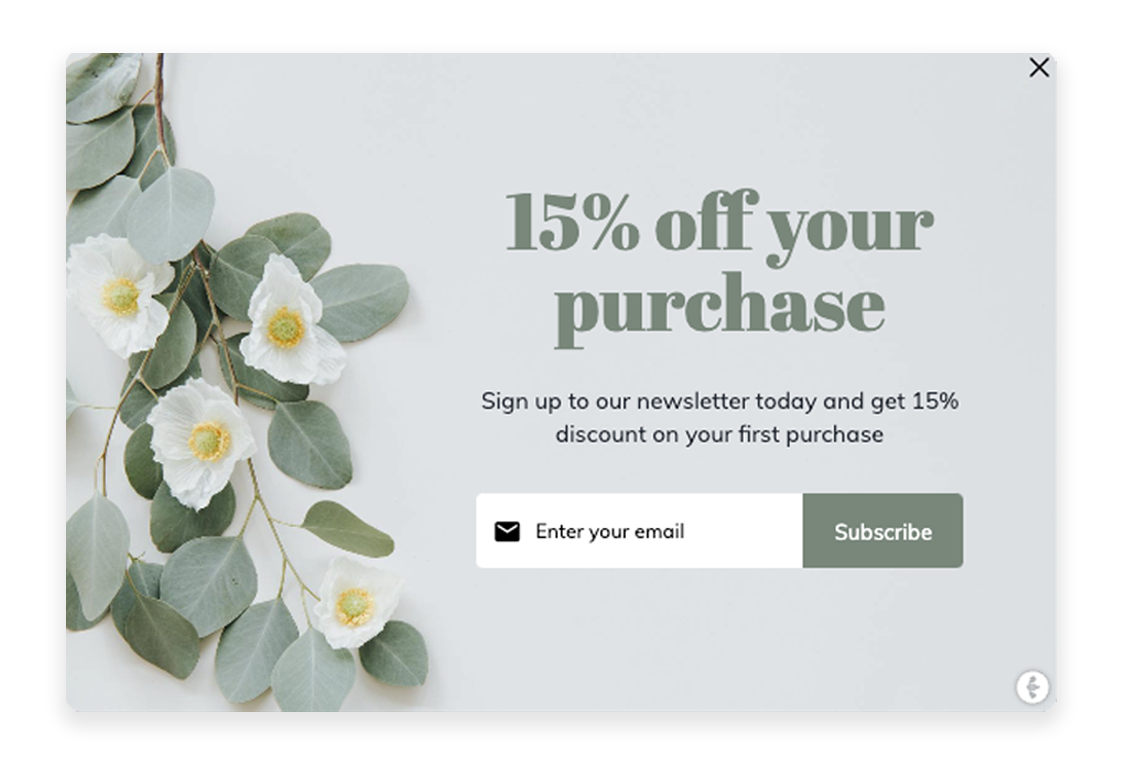
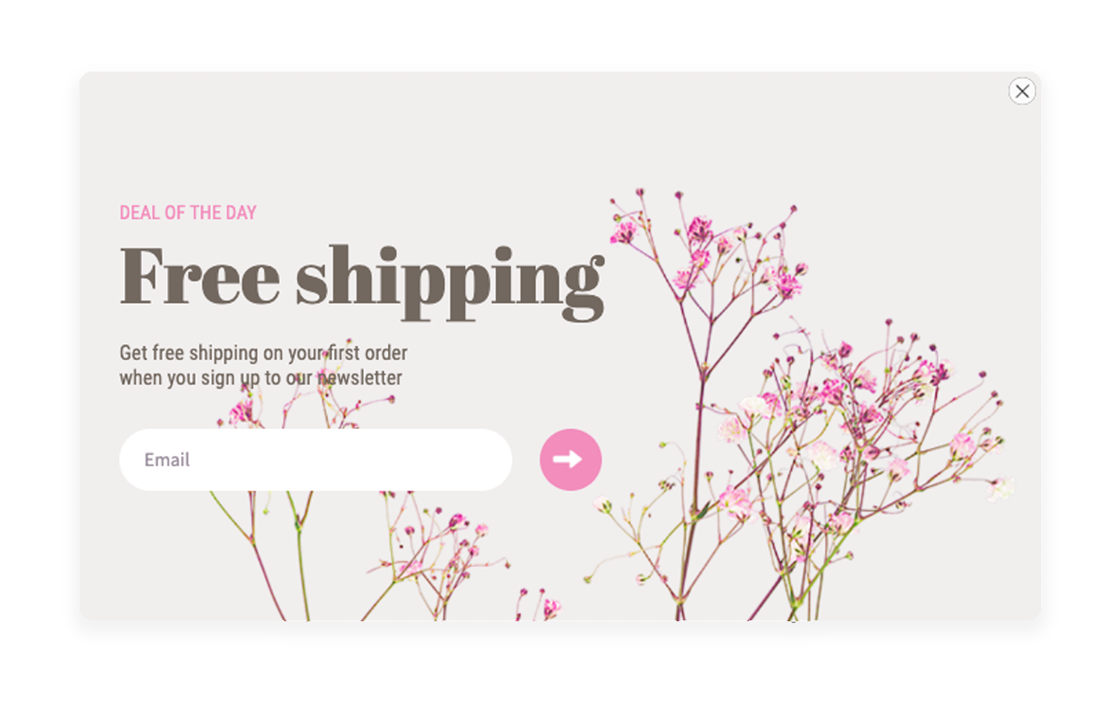
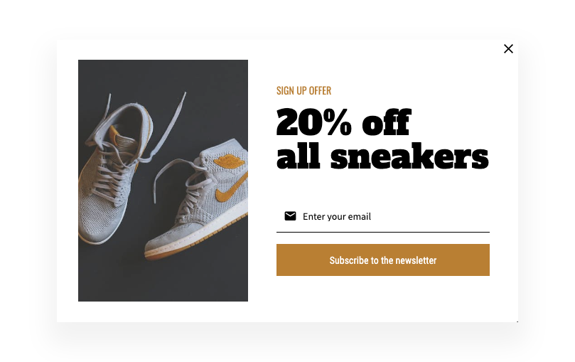
Number 1: Percentage Discount
Consumers are more likely to subscribe to a newsletter if they know that they can get a discount for doing so. This is because discounts can save them money on the items they are planning on purchasing. The most common incentive is a percentage discount on their purchase, usually 5-15%. There are a lot of discount strategies that you can use, so make sure to be quick with also delivering the discount code. Either directly in the popup or in an email. Why not both? By offering a discount, businesses can encourage people to become subscribers and then potentially become customers.
Target audience: New or unidentified visitors
Number 2: Static Discounts
Some companies don’t work with percentage discounts. If you are one of them, a good option is offering free delivery, a specific amount of discount (eg. 5€) or other static offers that don’t vary depending on the total order value. This will keep the sense of urgency and encourage people to act quickly, without eating up your margins.
Target audience: New or unidentified visitors with a certain value in their cart
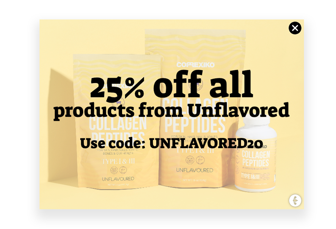
Number 3: Discount on category
Another option for discounts is narrowing down to a specific category or product instead of giving away a discount for their whole purchase. When targeted correctly, this will still have the visitors feel like they’re getting a good deal, which can lead to them becoming more loyal customers and encourage people to return to your site in the future.
Target audience: New or unidentified visitors on specific URLs or with specific products in their carts.
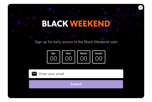
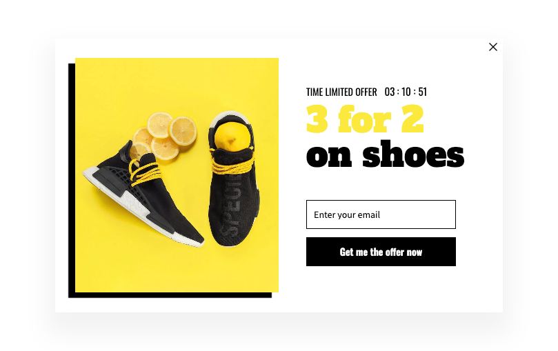
Number 4: FOMO (Time-limited offer)
FOMO, or the fear of missing out, is a powerful psychological tool that can be used to encourage visitors to convert. When customers feel like they might miss out on a great deal, they are more likely to take action in order to avoid missing out. This is a great approach for conversion, as it encourages customers to take advantage of your offer before it’s too late. This approach can be achieved by adding a deadline component to your newsletter signup, or using copies such as “only 5 left”.
Target audience: New or unidentified visitors
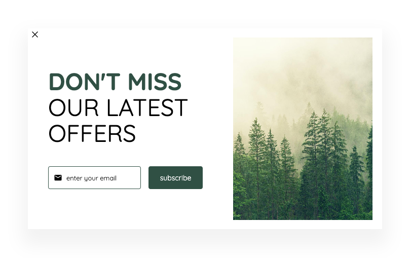
Number 5: FOMO (don’t miss..)
Another way of creating FOMO is with the hint of the fact that the visitor will miss out on something if they do not sign up. When people feel like they might miss out on great content or opportunities, they are more likely to take action in order to avoid missing out. It could be the latest news, exclusive offers or new collections. And once they’re subscribed, you can continue to market to them using your regular email content.
Target audience: New or unidentified visitors
Number 6: Exclusiveness (join our club)
Who doesn’t get curious when hearing about something exclusive? By limiting access to certain content or features on your site, you can encourage more visitors to sign up to the newsletter. This sense of exclusivity can create a feeling of urgency and encourage visitors to join the club and give you their email right away. Having an exclusive “club” also helps to build a stronger relationship with your customers and encourages them to return to your website in the future.
Target audience: New or unidentified visitors
Number 7: Raffles
Contests and raffles are a great way to boost your newsletter conversion rate. If there’s anything that everyone likes, it’s the chance to win something. Raffles are fun and exciting for customers, and they offer valuable incentives that encourage people to sign up and buy products from your store. One of the best ways to use a contest or raffle is to give away a gift card, gift basket or a free product. So if you’re looking for a way to increase your conversion rate, consider using a contest or raffle in your next newsletter campaign.
Target audience: New or unidentified visitors
Number 8: Pre-signups for upcoming collections or sales
When it comes to website conversion, exclusiveness can be a very powerful tool. Take advantage of your upcoming collections by offering an exclusive priority shopping to those who sign up in time. This works especially well if the collection is a collaboration or exclusive in some way. As a result, online businesses can see a significant increase in website conversion rates with little effort.
PS. Add a deadline component to add some extra FOMO.
Target audience: New or unidentified visitors
Number 9: Exit Intent
Popups that trigger when the visitor is about to leave are called Exit Intent popups. They can help you keep visitors on your website for longer periods of time and in the best of worlds, have them complete a purchase before they leave! With an exit intent popup, you’ll at least get their email. Make sure you trigger the Exit Intent popup before the visitor has taken action and at the right time, otherwise they might feel intrusive.
Target audience: New or unidentified visitors that is leaving the website
Number 10: Simple signup
Let’s not forget the basic no-offer-at-all signup. While we strongly recommend you work with any of the above use cases, some of you might feel that you just want the old-fashioned simple signup. And that’s totally fine! Make sure to design it with just as much effort and love as you would do for any other campaign. Remember, every interaction, in any channel, is a part of building your brand.
Target audience: New or unidentified visitors
May the conversions be with you.